Introduction
If you are a calligrapher looking to take your craft into the digital world, Inkscape has exactly the right tool for you. The Calligraphy Tool gives you a freehand drawing experience that feels close to writing with a real pen — complete with variable width, angle control, pressure sensitivity, and much more.
Even if you are not a calligrapher, this tool is worth exploring. It creates expressive, organic strokes that work beautifully for illustrations, lettering, and decorative design work.
In this guide, we will walk through every option in the Calligraphy Tool toolbar, so you know exactly what each setting does and how to use it effectively.
What is the Calligraphy Tool in Inkscape?
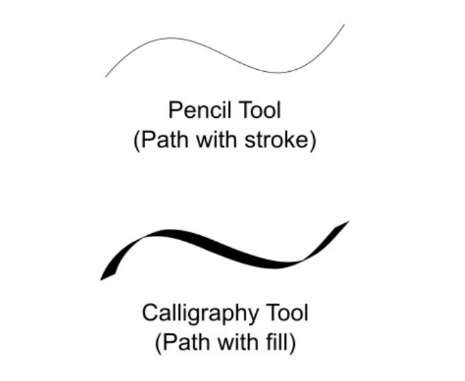
The Calligraphy Tool is a freehand drawing tool, but it works differently from the Pencil Tool. While the Pencil Tool creates a stroked path, the Calligraphy Tool creates a filled path — meaning the shape of your stroke is the actual filled outline, just like ink on paper. You can later edit it anytime using the Node Tool.
You can find it in the toolbox by its dip pen icon, or activate it instantly with the shortcut key C.
To draw, simply left-click, hold, and drag freely across the canvas. The result is a smooth, calligraphic stroke. For the best experience and the most control, a pen tablet is recommended — but the tool works with a mouse too.
In this tutorial, we’re using the XP-Pen G430 Graphics Tablet. It has a small, portable design with pressure sensitivity and a battery-free pen, making it convenient for smooth and natural drawing.
Calligraphy Tool Control Bar
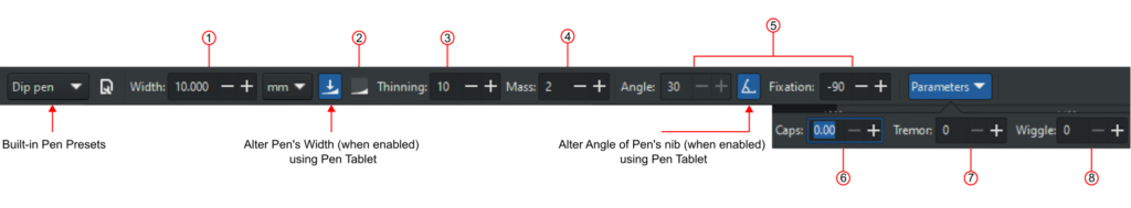
1. Width
Width defines how wide your pen nib is. The value ranges from 0.001 to 100, based on your selected units.
A great feature here is that you can change the width while you are drawing — no need to stop and go to the toolbar. Use the Right Arrow key to increase the width and the Left Arrow key to decrease it. This makes it easy to vary your stroke naturally as you write. The Home key sets the width to the minimum value, i.e., 0.001, while the End key sets the width to the maximum value, i.e., 100. Pressing Alt+X enables the Width entry field in the Tool Control bar. You can enter a number and then hit Enter to set an exact width while drawing.
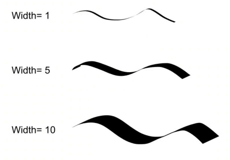
2. Trace the Lightness of the Background by Width of Pen
This option makes the pen width react to the brightness of the background beneath it. When enabled:
- The stroke becomes thinner over lighter areas.
- The stroke becomes wider over darker areas.
For example, if you draw over a rectangle with a gradient, light on the edges and dark in the middle, the stroke will be narrow at the edges and wide in the center. This can create some very interesting effects when layering strokes over images or gradients.
3. Thinning
Thinning controls how the speed of your hand movement affects stroke width. The value ranges from -100 to 100.
- 0 — Speed has no effect. The stroke stays the same width regardless of how fast or slow you draw.
- Greater than 0 — Faster strokes become thinner, slower strokes become wider. This mimics the natural behavior of writing quickly with a pen.
- Less than 0 — The opposite: faster strokes become thicker, slower strokes become thinner.
This setting adds a lot of natural character to your strokes, especially when combined with the Mass setting below.
4. Mass
Mass is inspired by the physics concept of inertia. A higher mass value means the pen “lags” slightly behind your cursor and smooths out sharp turns and quick jerks in your movement.
The default value is 2, which keeps the tool responsive. Increasing it makes the pen feel heavier and slower, which can be useful for producing smoother, more flowing strokes — especially when working with a mouse.
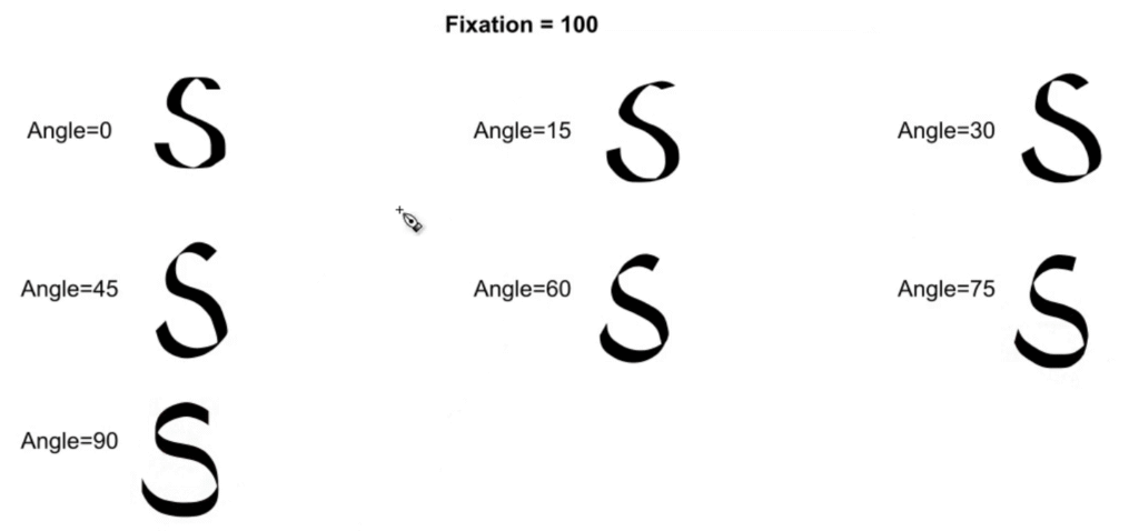
5. Angle and Fixation
These two settings work together and are central to getting a true calligraphic look.
Angle defines the angle of your pen nib. Each calligraphy style has its own traditional angle. For example, the Uncial hand uses around 25 degrees.
Fixation controls how strongly that angle is applied to the stroke. Its value ranges from -100 to 100:
- 0 — The angle has no effect on the stroke.
- 100 — The pen always writes at exactly the angle you have set.
- -100 — The pen writes at the set angle but in the opposite direction.
The key principle to understand: a stroke drawn parallel to the pen angle will be at its thinnest, and a stroke drawn perpendicular to the angle will be at its widest. This is what creates the distinctive thick-and-thin contrast that defines calligraphy.
You can also adjust the angle on the fly using the Up and Down Arrow keys while drawing.
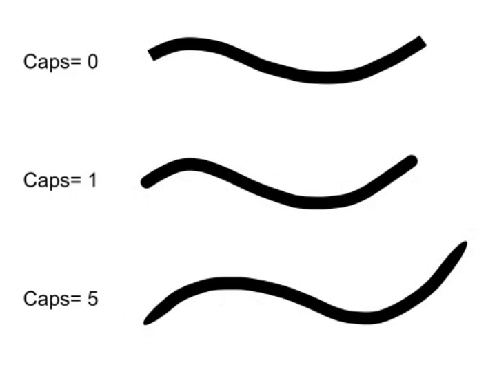
6. Caps
Caps control how rounded the ends of your strokes are. The value ranges from 0 to 5:
- 0 — Flat ends, no rounding.
- 1 — Round caps at the ends.
- 5 — Wide, elliptical ends that extend noticeably beyond the stroke.
Note that caps extend beyond where the stroke normally ends, so higher cap values will make your strokes visually longer than they would otherwise be.
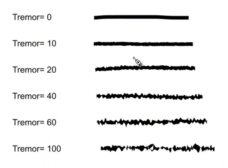
7. Tremor
Tremor adds a natural shakiness to your strokes. Lower values produce a subtle, slight unevenness, while higher values create heavy, blotchy strokes with significant wobble.
The speed of your drawing also affects the tremor result, giving you extra control over how organic or rough the stroke looks. With careful use, tremor can make digital calligraphy feel much more handmade and authentic.
8. Wiggle
Wiggle simulates the resistance of the drawing surface. A higher wiggle value makes the surface feel more “slippery,” causing the stroke to rapidly zig-zag as you move across the canvas.
At low values, it adds a gentle wave; at high values, the stroke becomes an erratic, rapid scribble. It is a more extreme effect than tremor and is best used deliberately for stylistic purposes.
Saving Custom Pen Profiles
Inkscape comes with several preset pen profiles built in — such as Marker, Dip Pen, and others — that you can select from the dropdown in the toolbar.
The more useful feature is that you can save your own custom pen profiles. Once you have set up the width, angle, thinning, and other parameters the way you like them, click the save icon in the toolbar, give your pen a name, and save it. It will appear in the dropdown list and be available whenever you need it.
This is a big time-saver if you regularly switch between different calligraphic styles.
Keyboard Combinations with the Calligraphy Tool
The Calligraphy Tool has several keyboard shortcuts that make drawing much more fluid:
| Shortcut | Action |
|---|---|
| Right / Left Arrow | Increase or decrease pen width (works while drawing) |
| Up / Down Arrow | Increase or decrease pen angle (works while drawing) |
| Home | Sets pen width to the minimum value, i.e., 0.001 |
| End | Sets pen width to the maximum value, i.e., 100 |
| Alt + X | Enables the Width entry field in the Tool Control bar to enter an exact width while drawing |
| Shift + Draw | Performs a Union operation with the selected path — the new stroke merges into it |
| Alt + Draw | Performs a Subtraction operation — the new stroke cuts out from the selected path |
| Ctrl + Draw | Traces a guide path (explained below) |
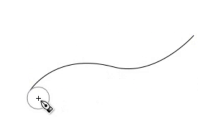
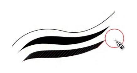
Tracing a Guide Path
One of the more advanced and unique features of the Calligraphy Tool is the ability to follow an existing path as a guide. It is useful for creating evenly spaced hatching lines or parallel strokes.
Here is how it works:
- Select an existing path on the canvas.
- Switch to the Calligraphy Tool.
- Hold Ctrl and drag your cursor parallel to the guide path. A grey circle appears, showing how far the new stroke will be from the guide.
- As you draw, the circle turns green — this confirms the cursor is correctly tracking the guide.
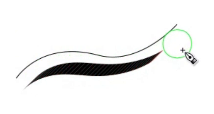
- As long as you keep holding Ctrl, each new stroke you draw will use the previous stroke as the new guide, maintaining consistent spacing throughout.
If the circle turns red, it means the cursor has lost track of the guide. Slow down your drawing speed and use a higher Mass value for better tracking results.
Using a Pen Tablet with the Calligraphy Tool
A pen tablet unlocks two additional features that are not available with a mouse.
Pressure Sensitivity
Enable the pressure sensitivity toggle in the toolbar. With this active, pressing harder on the tablet increases the stroke width, and lighter pressure produces a thinner line — just like writing with a real ink pen. This gives you a much more natural and expressive result.
Tilt Sensitivity
If your tablet supports tilt, enable the tilt sensitivity toggle. This uses the physical tilt of your pen to control the angle of the nib automatically. The Angle parameter in the toolbar will grey out when this is active, as the angle is now determined by how you hold the pen.
FAQs
Tools Used
Final Thoughts
The Calligraphy Tool is one of the most expressive tools in Inkscape. Between the angle and fixation controls, thinning, mass, tremor, and tablet support, it gives you everything you need to produce genuine digital calligraphy, or simply add organic, hand-drawn character to your designs.
Start with the basic settings and get comfortable drawing simple strokes. Then gradually experiment with angle, fixation, and thinning to see how they work together. With a bit of practice, the results can be remarkably close to real pen and ink work.